Architecting High-Converting Social Media Grids
Social media is no longer just a marketing channel; it is the primary digital storefront for most modern businesses. A user's first impression of your brand will likely occur on Instagram, LinkedIn, or TikTok. Architecting a social media grid that is visually stunning, highly engaging, and optimized for algorithmic distribution is a complex discipline. This guide reveals the strategies used by top-tier creative agencies to build massive online authority.
The Anatomy of High-Converting Social Grids
The aesthetic grid is the hallmark of a premium brand. When a user lands on your Instagram profile, they process the entire 9-square grid in a fraction of a second. This macro-view must communicate a cohesive color story, a consistent typographic style, and a clear brand mood. This is achieved by creating rigid design templates and establishing a strict content cadence. Alternating between heavy typographic quotes, negative space imagery, and human-centric photography creates a checkerboard rhythm that is deeply pleasing to the eye.
However, aesthetics must serve the algorithm. The social media landscape of 2026 is dominated by short-form, high-retention video content. Static graphics must be highly shareable and "savable" (such as infographics and carousels) to trigger the algorithm's amplification mechanisms. The cover frames of these videos must still adhere perfectly to the overarching grid aesthetic, requiring meticulous pre-production and editing workflows.
Copywriting is the invisible engine of social media design. A beautiful graphic with weak copy will fail. The hook—the first three words of a caption or the headline baked into the image—must instantly arrest the user's scrolling behavior. It must promise immediate value, provoke curiosity, or agitate a specific pain point. This synergy between striking visual design and aggressive, conversion-focused copywriting is the secret to scaling social accounts.
Community management and proactive engagement transform a beautiful page into an active community. Design systems must account for interactive elements: Instagram Story templates for Q&As, branded poll graphics, and high-fidelity assets for direct message outreach. A brand that only broadcasts will stagnate; a brand that designs for interaction will dominate.
Designing for the Crop
The same image is displayed at different aspect ratios in different places, and platforms change those ratios without warning. A layout composed for a square grid tile will be cropped in the feed, cropped differently again in a story, and reduced to a small circle as a profile image. Anything critical placed near an edge will eventually be cut off.
Design to a safe area rather than to the canvas. Keep the logo, the headline and any call to action inside a central region that survives the tightest crop the asset will face, and treat the outer margin as expendable background. This is the single change that most reduces rework when one asset has to be reused across placements.
Check legibility at the size it will actually be seen. Most social content is viewed on a phone, often scrolled quickly, sometimes with the screen dimmed. Type that reads comfortably at full size on a desktop preview can be illegible in the feed, and low-contrast overlays on photography are the usual culprit.
Templates Beat One-Off Posts
Social output is a volume problem. A studio producing individually designed posts will be inconsistent within a month, because each new asset is a fresh set of decisions made under time pressure. A template system fixes the decisions once — grid, type scale, colour roles, where the logo sits, how a headline wraps — and leaves only the content to change.
Build a small number of distinct layouts rather than one flexible one: a statement post, an image with a caption bar, a multi-slide carousel, a quote, an announcement. Each with defined limits on how much text it can hold. Most template systems break because they allow unlimited copy, and the first long headline destroys the layout.
Templates also make handover possible. Once the system is defined, routine posts can be produced by the client's own team without the identity drifting, which is usually what the client actually wants and rarely what they are given.
Regional Language and the Festival Calendar
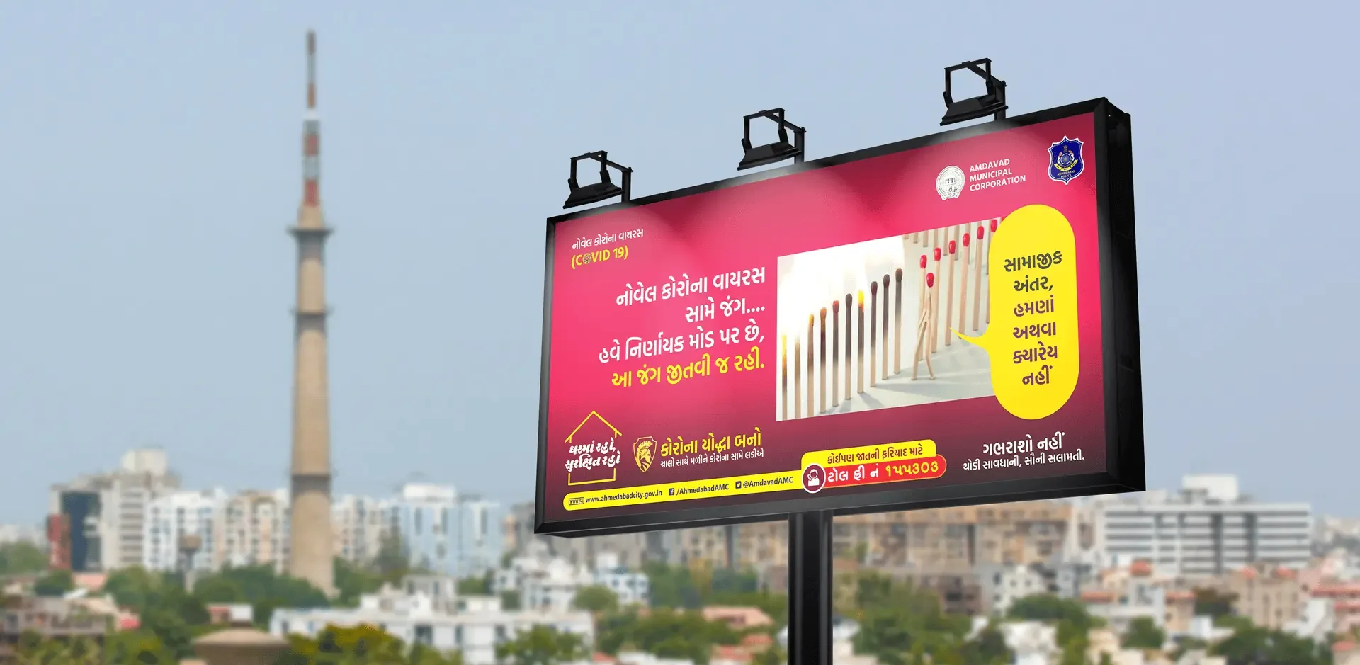
Designing for an Indian audience frequently means setting Gujarati, Hindi or another Indic script alongside Latin, and the two do not behave the same way. Devanagari and Gujarati sit on a headline stroke, have different vertical proportions, and need more line height than Latin at the same nominal size. Type set without adjusting leading looks cramped and often clips ascenders and matras.
Choose fonts that genuinely support the script rather than relying on a system fallback, and check the rendering of conjuncts and matras before committing — substitution failures are common and frequently go unnoticed by designers who do not read the script. Pair the Latin and Indic faces deliberately so weights and proportions correspond.
The content calendar in India is driven substantially by festivals, and the good slots are predictable a year ahead. Navratri, Diwali, Uttarayan and regional observances concentrate attention, and every competitor posts on the same days. Work planned in advance, with the template system already built, is the difference between arriving early with something considered and posting a generic greeting late.
Recent blog
Need Help Implementing This?